Tag: branding
-
Selling Sunset, Selling Tampa and the Parisian Agency – It’s all about Brand Marketing
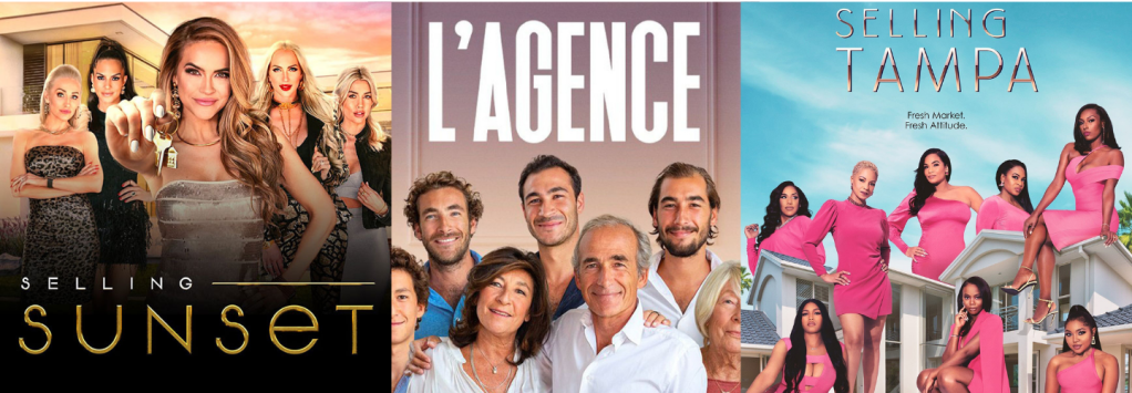
Real estate brand marketing tips
-
Hello Kitty Train
Why do places like Japan think of inventive ways of taking the mundane task of commuting to a whole another level? Hello Kitty is getting their own themed bullet train which will take to the tracks on June 30th.
-
Branding gone wrong
Some competitions make sense. But when they don’t, boy does the community have an opinion about it. The Sony Centre for the Performing Arts; the Toronto Centre for the Arts; and the St. Lawrence Centre for the Arts, currently called Civic Theatres Toronto have opened up a “national public naming competition” − with a “great prize…
-
Bachelor of Branding Charrette
The Institute without Boundaries is known for their charrette process. A quick, dirty and effective way of producing many ideas and then editing it all down to the best possible outcomes. This charrette was to help the faculty and staff develop a new curriculum for a new bachelor degree. As they are in the preliminary…
-
IT’S A START 2016 – Creative Camp – Daryl D’Souza, NextStep Social Media Consulting + Lou Dawg’s BBQ
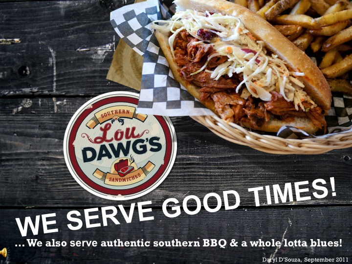
Daryl D’Souza is the co-owner of the Toronto-based Lou Dawg’s restaurants, and a marketing instructor for the G. Raymond Chang School of Continuing Education at Ryerson University. As a Ryerson computer science alumni, he worked as an information technology professional in the eHealth industry. Daryl completed a Masters of Business Administration and launched Lou Dawg’s…
-
New TAS website
When we launched the first iteration of the TAS website back in the summer of 2013, we focused on presenting the new brand identity and featuring our Four Pillars of Sustainability iconography. As our blog and engagement within the communities started to grow and gain traction we realized that our original position of the blog…
-
Inviting Inspiration
The stone is the source of inspiration because of its beauty, but also the symbol of hardship when it comes to wine growing.
-
Pharmacy Market
The graphic design was applied to different identity carriers as store concept, website, packaging design for their own series, bags, printed matters, exterior signage, posters, receipts etc.
-
Long Beautiful Hair
This logo is made of hair because hair it´s the most representative thing of the people in the agency.
-
Attractive Organic Aesthetic
A brand dedicated to organic food that seeks to create links between rural producers and urban consumers and tries to improve the quality of the products we consume in our day to day lives.
-
Recycle and Reuse
An avant-garde fashion store that aims to inspire and excite consumers in ways similar to leading retail icons such as dover street market, colette and united arrows.
